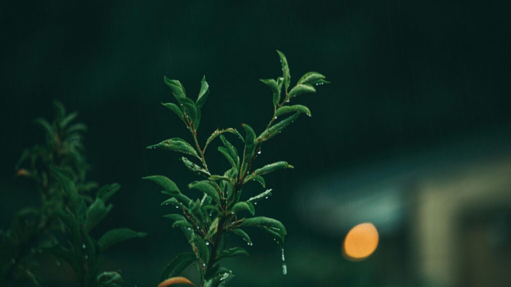
Picture walking into a space where shadowy trees seem to reach through the windows. Light barely touches the floor. The walls feel steady. The space feels rich without showing off. That is the power of dark green. You have probably noticed it lately. Moody interiors on social media. Deep green coats in shop windows. Study rooms that look calm and serious at the same time. People call it old money style. Others call it dark academia. Some just say it feels right for now.
Dark green keeps coming back because it offers something many of us want. Calm without boredom. Depth without heaviness. Style without noise. Dark green is not just a color. It is an atmosphere. It blends nature’s depth, quiet ambition, a sense of prosperity, and modern elegance in a way that feels natural and lived in.
The Meaning & Psychology of Dark Green


Dark green carries weight. Not in a bad way. In a grounded way. At its core, it stands for abundance, growth, and stability. These are not fast ideas. They take time. That is why darker greens feel more mature than light ones. They suggest roots, not just fresh leaves.
There is also ambition in dark green. It feels focused. Serious. In some cases, when pushed too far, it can hint at envy or greed. But used with balance, it feels steady and confident. Light green feels fresh and calming. It lifts the mood quickly. Dark green works more slowly. It settles in. It stays. A sense of trust just settles in here.
Dark green keeps minds sharp, somehow. A room painted this way stays calm but never dull. It reduces stress without making a space feel sleepy. That is why it works well in home offices, studies, and reading corners. It creates a sense of safety and endurance.
Green appears through culture in quiet forms. Paper cash carries its shade on purpose. That color means reliability, worth. Across parts of Asia, it ties to lasting years, fresh beginnings. Lingering in deep green? That hints at chasing goals while respecting old ways. Patience lives here. Structures meant to endure rise slowly.
Dark Green in Interior Design
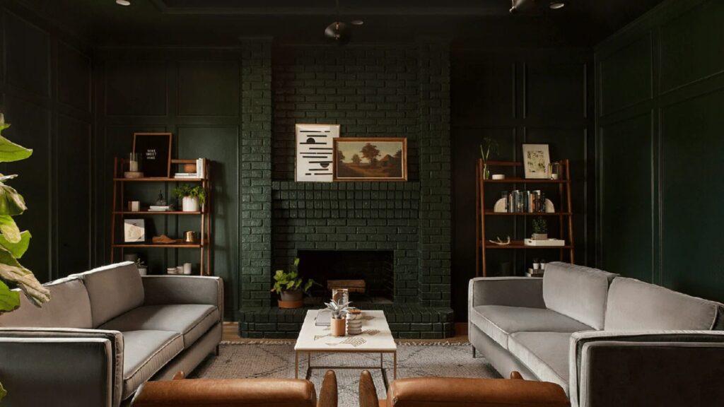
Dark green works so well right now because homes are changing. Some crave rooms with soul. Cozy spots lit low. Moody yet inviting tones shape how we relax. Think deep hues blended with living textures. Instead of bright whites, shadows grow in depth. Lush greens slip through calm, alive. Not harsh bark or wild vines. Smooth earth tones settle quietly across months. Summer light bounces softly off them. Even the spring air feels richer near these walls. Autumn doesn’t own darkness anymore.
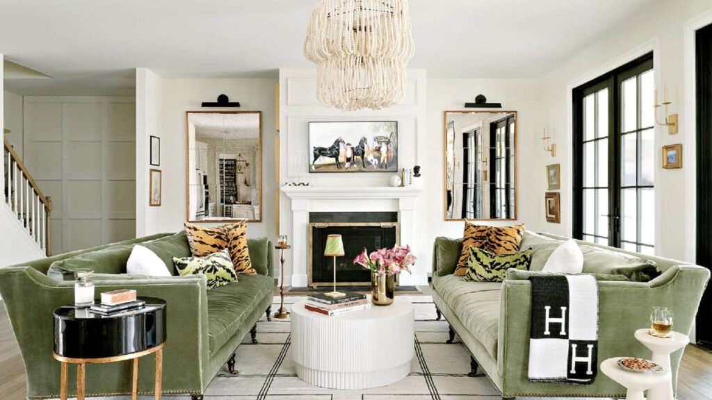
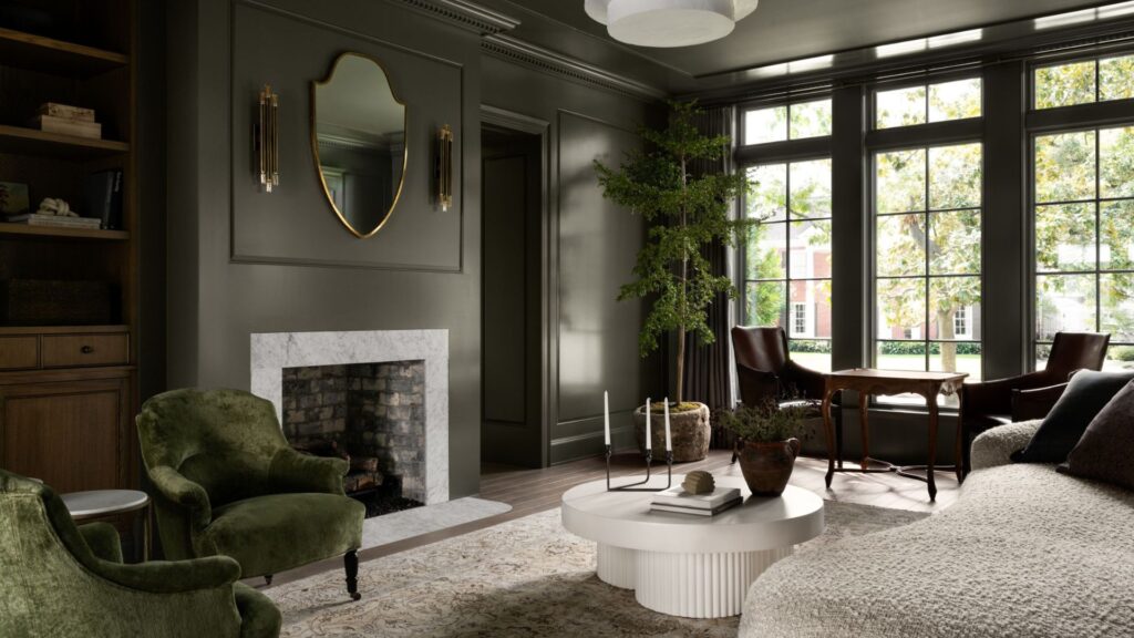
Accent walls are one of the easiest ways to use it. A dark green wall in a living room adds depth instantly. In a bedroom, it feels calm and protective. In a home office, it helps you focus and slow down. The space holds attention without demanding it. Cloth brings out deeper tones, like light finding its way through leaves. Think of plush couches, thick drapes, and padding under your arm. Dark green loves texture. It looks better when it has something to play against.
Dark green fits well in kitchens, somehow both timeless and fresh. Where light glows softly, bookshelves take on depth in that shade. Dining spaces gain quiet warmth when painted this way.
Start with gold, it whispers elegance without shouting. Brass does something similar but warmer, like sunlight caught in metal. A touch of black steps in to sharpen things, giving contrast that feels current. Instead of weight, try cream; it floats. Ivory works much the same, softening corners you didn’t know were sharp. Light wood enters quietly, stopping any sense of heaviness before it settles. Soft shades such as tan leather or beige help calm the overall feel. A touch of deep color – cobalt, maybe rust brings life without overwhelming.
A dark green home office feels focused and calm. An emerald bedroom feels restful and refined. A forest green living room feels perfect for slow evenings and long conversations.
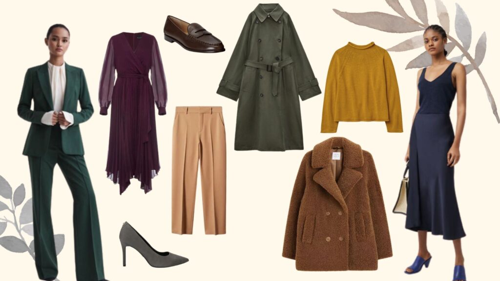
Dark Green in Fashion & Personal Style
It never really disappears from fashion, waits patiently. It works like a neutral, but with more depth. Jackets, sweaters, pants, outer layers, each built to last. These pieces age well. They do not chase trends. They stay useful.
Many aesthetics lean on dark green. Dark academia pairs it with wool, books, and layers. Quiet luxury uses it in clean shapes and good fabric. Forest core mixes it with natural textures. Vintage menswear has trusted it for decades.
Wearing dark green is simple. Start with neutral colors. Cream, brown, black, gray. A touch of leather – shoes or maybe a belt – brings it together. Finish with something shiny on the wrist, just a hint. This combo moves easily through the year. When cold hits, slip it under wool coats or chunky sweaters. Heat waves? Still holds its own and catches eyes when least expected. Dark green linen with white feels relaxed and fresh. It does not need attention. That is why it works.

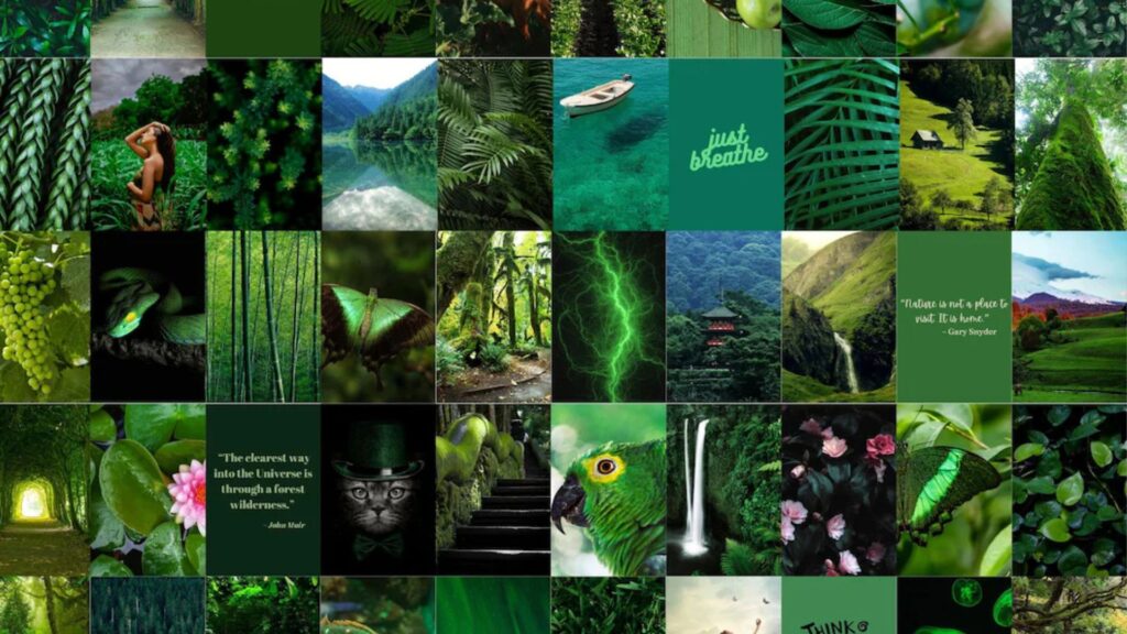
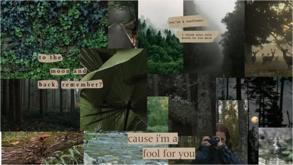
Dark Green in Aesthetics & Mood Boards
It dominates mood boards because it creates a feeling fast. Dark academia uses it with old books, wood, and soft shadows. Emerald maximalism layers it with bold textures and rich details. Forest gothic leans into mystery and nature. Old money spaces use it quietly, paired with quality materials.
Certain elements show up again and again. Antique brass. Leather-bound books. Houseplants. Marble surfaces. Art that feels thoughtful, not loud. Color pairings shape the mood. Charcoal adds depth. Burgundy brings warmth. Mustard adds contrast. A touch of soft pink might lift the space without effort.
Fingers notice texture just as much as eyes catch color. Rough weaves, soft pile, even grainy bark-like panels – these shift how a room sits in your bones. Bumpiness lingers on skin long after sight fades. A napkin’s starched edge, a rug thick enough to swallow sound, the weight of touch builds presence. Cold steel may shine, but never hugs back. Warm light keeps the mood right – harsh ceiling bulbs tend to ruin it. Lamps give off a gentler glow compared to strong overheads. A deep green shows its strength when lit just enough to shimmer slightly.
Dark green ideas for everyday life
You do not need to change everything to feel the effect of this color. Start small. A throw pillow. A candle. A dark green mug or notebook. A small shift here or there might seem unimportant, yet it shapes how a room sits with you.
Start with something small – maybe sheets, a floor cloth, or just one wall. Big shifts sit easier when they aren’t your first move. Later on, cover every wall. Bring in a plush couch. Drape thick fabric by the windows. Those steps land right only after you’re sure the shade fits who you are.
Heavy feelings come from too much dark green when there is no light. Lamps help, so do mirrors, along with paler finishes nearby. A useful detail pops up here. Dust stays hidden more easily on deep green compared to brighter shades. Cleaning becomes less frequent because of that one trait.
Read Our Post: Remitted
Conclusion
Dark green offers depth in a world full of bright colors and fast trends. It feels grounding. Elegant. Quietly confident. It does not rush you, nor compete for attention. It simply exists, steady and sure.
What is your relationship with dark green? Have you painted a wall? Bought that hunter green coat. Still wondering if it fits? That color lives in thoughts more than closets sometimes. In a noisy world, dark green whispers. Stay rooted. Grow slowly. Own your depth.
FAQs
It often stands for growth, stability, and quiet confidence.
It feels calming when balanced with light and warm lighting.
Yes. Use it on one wall or with lighter accents.
Yes. It layers well in winter and looks fresh with white in summer.